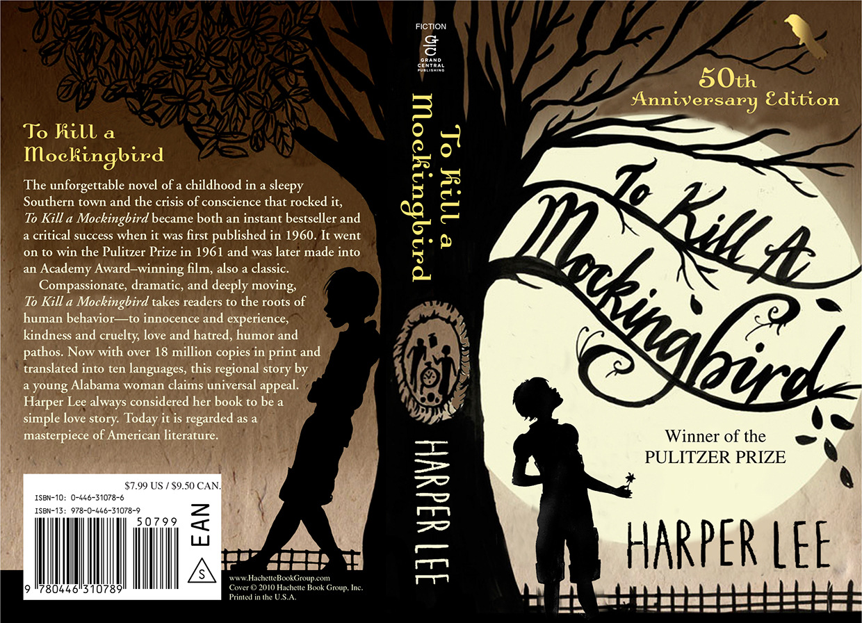
After all, we are probably all guilty of having picked out a book solely based on the cover before. Heck, I'll throw it out there - the very first thing that catches my attention about a book is a beautiful cover. "Beautiful," by the way, is not the same as "eye-catching." Eye-catching: big bold letters, bright colors, and glitter-pixie throw up all over it. Beautiful: thought-provoking design.
With Shelf Candy Sunday, I hope to showcase a new beautiful book cover every week. Time allowing, I'd also like to find out more about the illustrator and maybe do a short showcase/blurb/interview. I don't have any of that cool stuff about illustrator Sarah Jane Coleman today, but let me share her amazing cover with you anyway:
What I love: Absolutely everything. This cover lends a modern twist to a great American classic. Design-wise, I love love love that the book title merges into the branches of the tree. I love that the tree is pictured, because it's one of the most interesting symbols in the book. I love that there's a mockingbird hidden in the branches at the top. I love the additional mystery of shadow-figures. I love that it's nighttime, because most of the exciting events in the book happen at nighttime.
Lastly, I love that the author's name is in a clear, tall font, because it was kind of small and insignificant in past covers and I believe that if you write a great American classic, you kind of deserve to have your name shouted from rooftops. Or at least, for your name to be noticeable on the cover of said great American classic. Now that it has its own very cute font, all-caps and attention-grabbing, Harper Lee is finally bound to get noticed by the thousands of high school students who are required to read To Kill a Mockingbird every year.
Read a litte more about Sarah Jane Coleman's process while creating this cover here.
What about you? Do you love this cover? Are there any other great American classics with remodeled covers? Feel free to share in the comments!


No comments:
Post a Comment